- Community
- Discussions
- General Office
- 4/18 New Customer Page Layout
- Subscribe to RSS Feed
- Mark Topic as New
- Mark Topic as Read
- Float this Topic for Current User
- Bookmark
- Subscribe
- Mute
- Printer Friendly Page
4/18 New Customer Page Layout
- Mark as New
- Bookmark
- Subscribe
- Mute
- Subscribe to RSS Feed
- Permalink
- Report Content
04-18-2023 01:24 PM
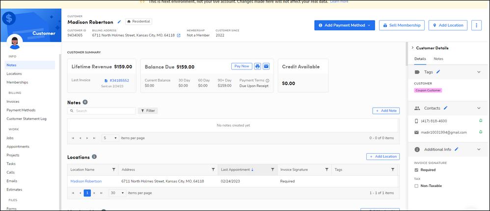
We are having a very difficult time with the new location and customer page layouts. While I see the benefit for the billing side of things, it is not beneficial when making calls and seeing customer contact information, especially if they have multiple contacts and we have to expand it every time. Having that information easily accessible at the top was very convenient for quick reference. The purpose of going to the customer page for us often is to contact the customer or see their information, and having their details to the side and collapsible makes it more difficult. Also, the customer tags are very important for how we've flagged accounts in our system and they are not as easily seen in this new layout.
- Labels:
-
General Office
-
Pool & Spa
-
Release
- Mark as New
- Bookmark
- Subscribe
- Mute
- Subscribe to RSS Feed
- Permalink
- Report Content
04-19-2023 07:43 AM
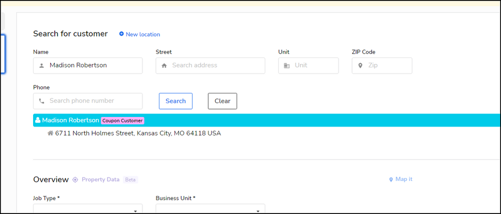
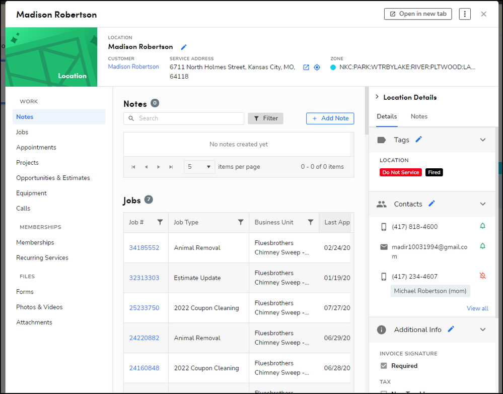
So I did go in and test this in the next environment and are you talking about contacts on the actual appointment or through the search bar? I did try it multiple ways and find that I can see everything fairly easily. I will show examples below!
I am wondering if the update might look different than it looks in next! Please share if you can!
Chicken Lady Speaks
- Mark as New
- Bookmark
- Subscribe
- Mute
- Subscribe to RSS Feed
- Permalink
- Report Content
04-20-2023 08:35 AM
Thank you for your response! It looks the same, but specifically on our commercial pages where we may have 7 phone numbers to reach out to and multiple emails, it has been obnoxious to expand the contact panel every time to see who to call or which emails to verify.
I am not always quick to adjust to changes, so I guess it will be about re-training my eyes to look somewhere else for the tags!
- Mark as New
- Bookmark
- Subscribe
- Mute
- Subscribe to RSS Feed
- Permalink
- Report Content
04-20-2023 08:39 AM
I can totally understand that. At least the changes will be less frequent! 😅
Have a great rest of you week!
Chicken Lady Speaks
- Mark as New
- Bookmark
- Subscribe
- Mute
- Subscribe to RSS Feed
- Permalink
- Report Content
04-19-2023 07:35 AM
We have not received our update yet. I am interested to see as we also rely heavily on our tags. If they are not easily accessible this could be a big issue.
Thanks for bringing this to, at least, my attention prior to our update. I will be happy to weigh in once I've seen it!
Chicken Lady Speaks


