- Community
- Discussions
- General Office
- Re: New Search Screen
- Subscribe to RSS Feed
- Mark Topic as New
- Mark Topic as Read
- Float this Topic for Current User
- Bookmark
- Subscribe
- Mute
- Printer Friendly Page
New Search Screen
- Mark as New
- Bookmark
- Subscribe
- Mute
- Subscribe to RSS Feed
- Permalink
- Report Content
04-12-2023
06:24 AM
- last edited on
05-03-2023
03:22 AM
by
LBabayan
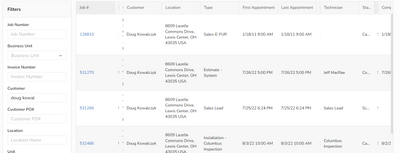
Is it just me or is this new mandatory search screen horrible? The old version was streamlined and concise and so easy to use. It actually would fit all filter boxes on one screen. This new one is so spread-out that I have to scroll to get to the filters I need at the bottom. Please give us back the option to use the old version!
- Labels:
-
General Office
- Mark as New
- Bookmark
- Subscribe
- Mute
- Subscribe to RSS Feed
- Permalink
- Report Content
05-11-2023 05:16 AM
Yes!! This would be helpful a helpful update!
- Mark as New
- Bookmark
- Subscribe
- Mute
- Subscribe to RSS Feed
- Permalink
- Report Content
05-10-2023 12:17 PM
... or give us the ability to choose (and save) which columns are displayed in the search.
- Mark as New
- Bookmark
- Subscribe
- Mute
- Subscribe to RSS Feed
- Permalink
- Report Content
04-20-2023 04:57 AM
Definitely not a fan as well. I don't like having to scroll down a page to access other search options. The option to switch back to the older version is gone, so this isn't a resolution anymore. Bring back the older version!!
- Mark as New
- Bookmark
- Subscribe
- Mute
- Subscribe to RSS Feed
- Permalink
- Report Content
04-12-2023 01:53 PM - edited 04-12-2023 01:56 PM
Hey Gina, if you click the "Switch back to older version" icon, you should be able to revert. I did a little video on it below, let me know if this solves a problem.
https://www.loom.com/share/77c7db07ac284b008f1c209eebe2cc5a
- Mark as New
- Bookmark
- Subscribe
- Mute
- Subscribe to RSS Feed
- Permalink
- Report Content
04-13-2023 06:44 AM
The option to switch back to old version went away with their last update.
- Mark as New
- Bookmark
- Subscribe
- Mute
- Subscribe to RSS Feed
- Permalink
- Report Content
04-12-2023 07:38 AM
Can you post a screen shot?
- Mark as New
- Bookmark
- Subscribe
- Mute
- Subscribe to RSS Feed
- Permalink
- Report Content
05-10-2023 12:15 PM
- Mark as New
- Bookmark
- Subscribe
- Mute
- Subscribe to RSS Feed
- Permalink
- Report Content
04-13-2023 06:43 AM
Hi Dave,
The option to switch to the old search screen disappeared with their last update.
- Collect and Apply Payment to select the invoice I am on (current)? in Accounting
- Cannot sort invoices by column headers in Collect Payment screen anymore? in Accounting
- Technician Chat Appearance in Dispatch
- Site Plan / Blueprint Integration in Mobile
- Business Unit and Job Type Limits Not Being Honored in Call Booking


