- Community
- Discussions
- General Office
- Re: Update is cumbersome
- Subscribe to RSS Feed
- Mark Topic as New
- Mark Topic as Read
- Float this Topic for Current User
- Bookmark
- Subscribe
- Mute
- Printer Friendly Page
Update is cumbersome
- Mark as New
- Bookmark
- Subscribe
- Mute
- Subscribe to RSS Feed
- Permalink
- Report Content
11-02-2023 06:14 AM
The latest update is cumbersome for our office staff. It takes more clicks to verify valid phone numbers or email addresses on accounts, where as previously we could see those things at a glance. Very inefficient for busy days.
Ideas?
- Labels:
-
Customer
-
Customer Profile
-
Location Profile
- Mark as New
- Bookmark
- Subscribe
- Mute
- Subscribe to RSS Feed
- Permalink
- Report Content
02-28-2024 12:04 PM
https://ideas.community.servicetitan.com/ideas/COMMUNITY-I-6057 Please vote for them to let us keep the option to use the old version! We are struggling with this monstrosity on a regular basis and this is our slow time of year. When we get busy as the weather warms up, we are going to be SCREWED
- Mark as New
- Bookmark
- Subscribe
- Mute
- Subscribe to RSS Feed
- Permalink
- Report Content
11-02-2023 09:29 AM
When a call comes in and our dispatchers are trying to capture the essence of the call they can not quickly verify the contact info without making about 5 extra clicks. That makes the customer wait too long while dispatch looks for or adds contact info. (or dispatch just won't do it because of the time and volume of calls coming in)
Some of the updates ST has made are beneficial but the pull-up time for a new screen to open seems to be slower with each update and "improvement."
I appreciate innovation and love new ideas, but only if they are beneficial to work flow.
Thank you for letting me air my thoughts.
Chris Krumholz
- Mark as New
- Bookmark
- Subscribe
- Mute
- Subscribe to RSS Feed
- Permalink
- Report Content
11-02-2023 09:55 AM
Do you have the job booking screen set up so that new pages open (job opens at side of page) or do you have an eyeball icon right beside the customer and location info?
Acclaimed! Heating Cooling and Furnace Cleaning
- Mark as New
- Bookmark
- Subscribe
- Mute
- Subscribe to RSS Feed
- Permalink
- Report Content
11-02-2023 11:57 AM
so that new pages open (job opens at side of page)
- Mark as New
- Bookmark
- Subscribe
- Mute
- Subscribe to RSS Feed
- Permalink
- Report Content
11-02-2023 12:08 PM
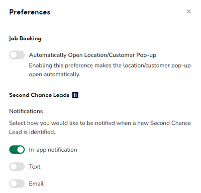
You could try changing the preferences to not open that flyout and then it would have the eyeball icon beside it, kind of the way it used to be. This might make it a bit easier to navigate on one page than having all the extra tabs open?
Acclaimed! Heating Cooling and Furnace Cleaning
- Mark as New
- Bookmark
- Subscribe
- Mute
- Subscribe to RSS Feed
- Permalink
- Report Content
11-02-2023 03:54 PM
Thank you
- Mark as New
- Bookmark
- Subscribe
- Mute
- Subscribe to RSS Feed
- Permalink
- Report Content
11-02-2023 07:36 AM
I also find that whenever I try to add email address for a new customer, it will not take it.
- Mark as New
- Bookmark
- Subscribe
- Mute
- Subscribe to RSS Feed
- Permalink
- Report Content
11-02-2023 06:29 AM
Is it the extra clicks to get to the "Contact Methods" section of the profile that is causing it to be cumbersome?
Acclaimed! Heating Cooling and Furnace Cleaning
- When customer purchases multiple ongoing monthly memberships in Memberships or Service Agreements
- Editing estimate/proposal templates in Pricebook
- Please vote for this updated feature! Customer Since Field in General Office
- Enhance Pricebook Tagging Automation & Add Conditional Logic to Workflows in Pricebook
- Stopping unnecessary updates and fixing long terms issues. in General

